Your Opinion, Please

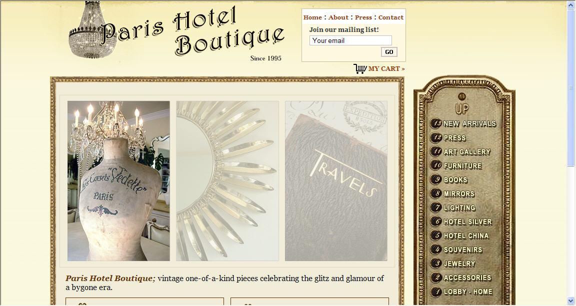
I am in a bit of a quandary. I have had my website, Parishotelboutique.com for almost 6 years now. I am contemplating changing the background wallpaper. I have inundated my friends with e-mails to select their favorite. I thought it may be fun to do a survey
so you can select your favorite. There is the current background or two versions of solid. Any comments would be appreciated. Please vote (on the right) too!

#1 Current wallpaper - Click Here
#2 Wallpaper - Click Here
#3 Wallpaper - Click Here

Comments

Anonymous said…
Well now, since I'm the first to vote for #3, let me say that I feel the color projects the name of the site in the best manner. It also looks fresh with just the right amount of color. Of course I love the sparkly chandy too! Jane@atticmag
Thanks Jane! I appreciate your input. I am so torn between the three. It's such a small change but I want it look right!! Lynn
Alkemie said…
Hi Lynn, I actually like #1 or #2. LOL this doesn't help because Jane voted for #3. I think #2 is a bit of a cleaner look for the site while #1 reminds me of an old paris hotel - probably something about the wallpaper. Which one do you like the best?
SimplyGrove said…
I love the first one!! They all are beautiful but the first sticks out to me. Thank you for visiting my blog! I post items from your store all the time!
Alkemie: Thank you for your post Karen! I agree that #2 is cleaner and so the pictures pop out. The original may be a bit too busy and time for a change because there is already a lot going on with the picture frames and chandelier. But, the current wallpaper does look like a "Paris Hotel" and that's the point to! What to do...what to do...

Simply Grove: Thanks for the post! I like the current as well, but see my comments above as to why I want to change. Thanks so much for posting about my site on your blog. I love reading your blog and am really appreciate the posts!

Lynn
Anonymous said…
I like no. 1, but think no. 3 is slightly clearer without losing the softer feel. No. 2 is too strong for the typeface and loses the romanticism for me.
Thanks Linda! I appreciate your opinion! Did you click on #2 link and see it as a full page? I think #3 may be too yellow. I am just thinking that the simpler background makes the site less busy and the photos stand out more. Hmm....
Alkemie said…
Lynn, A dilemna indeed. #3 was too yellow for me - that was why I didn't vote for it.
Unknown said…
I am going back to #1. I think the pattern is subtle enough that it doesn't compete with the frames around the items or the chandelier. I think the plain ones are too plain. I like the layered look of the first and original one. (BTW, I LOVE the narrow gold/gilt frames around the items; they're simply elegant and elegantly simple.)

If you like pattern but are tired of the original one, perhaps you could find something else that is tone-on-tone in white, ivory, cream, or pale ecru/beige. Possibly a large flowing all-over pattern (like an elegant damask table cloth design) would be more unifying than the separate oval medallions--which, because they are individual repeating units, seem to chop up the background a bit.

You asked!

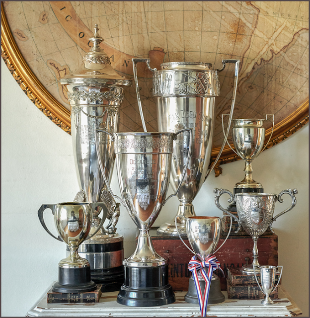
I really can't fault your presentation and overall style at all. Your products are GORGEOUS (I especially like the Hotel Silver pieces), the frames are simple and elegant (said that once already!) and the descriptions are concise and well-worded. (I did notice a couple of typos/errors/missing words in your blog, but that's because I am a proofreader by trade and I can't help myself!)
AlleySally
Alley Sally, thanks for your comments! Funny you should mention a tone-on-tone background. I actually have my web designer working on some examples. I think that "repeat" pattern is what's distracting for me. I just don't want the site to be too "frou frou", although it's been this way for 5 years!

Many thanks again for the sweet comments. I hope I don't have any typos on my website :) Lynn

Popular Posts